Showing posts with label Market Trends. Show all posts
Showing posts with label Market Trends. Show all posts
Saturday, May 12, 2018
Trying to save a few dollars isn't worth it.
We've been trying to buy an ETF, but it hasn't gone through because it went up slightly over our buy threshold. We're pretty hands-off, so after two weeks of it not going through, we decided to put in a market order for the fund. This way the buy will go through no matter what. That's what we get for trying to be cheap bastards.
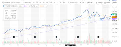
Now let's talk about the DEATH CROSS, which, despite sounding like a rad metal band is actually a real thing:
The blue line in the chart above is the current price for SPY. The orange line is the 50 dma (daily moving average). You can think of this as how things have gone in a fairly recent time frame. The purple line is 200 dma, which is how things have been doing in the longer term.
Watching how these lines are doing in relation to each other is a standard tool for assessing price changes over time. These trend lines could be used to let you know when increases and declines are happening in a sustained way. In the chart above, the three lines appear to be converging. When the blue line is crossing one of these dma lines, it means that the price is under what is has been for the last 50 or 200 days. So when the 50 dma crosses the 200 dma that means that prices are steadily going down. That's our friend, the "death cross". Crossing the 200 dma with the daily price for a few days is a first sign to take defensive action. The "death cross" is when you should really think about or should have already done something. Defensive action doesn't mean we have to dump everything into cash, but potentially the portfolio balance should be change slightly.
Next time, let's talk about what this defensive action may look like. We have a fairly diverse portfolio, so we may already be partially prepared for this.
Profit!
Saturday, June 16, 2012
The World's a Mess, It's In My...Portfolio?
 |
| Members present: Brian, Bickford, Danak |
 |
| ENZL: New Zealand is not looking so good as a buy right now. We should wait and see. |
 |
| EWZ: Oh my goodness. What a nasty, nasty disaster. Wait and see, hold on hope, recoup losses? |
 |
| SPY: Doing okay. |
 |
| AT&T: Hooray telecom. |
We talked about two philosophies of buying during a crap economy.
1. Buy something that is down, because hopefully it will swing back when things recover (assuming the business still exists in the long-term).
2. Buy something that hasn't crashed, because you think it will remain stable. (See: low-end candy, the dollar store, etc. These are things that do well in a booming economy, but people still need, regardless.)
Brian found this daunting article from Random Roger about what the a yield curve is, and what it may say about the health of the economy.
Basically, yield curve is a plot of debts issued for different time scales. For example, a hypothetical 2 year CD might yield 2% interest, a 5 year might yield 4% interest, and a 10 year might yield 5% interest. This yield curve would be increasing and leveling off over time. This would tell us that the debt issuer is doing well. You give somebody money for a longer amount of time, so you should expect more payoff for the added risk of more time.
Here's a nifty graphic explaining the geometry of various yield curve curves.
If you have an inverted yield curve, that means that the longer you carry debt, the less you can expect to get from it. That is a problem. The yield curve is another macro indicator of the economy as a whole.
This is a big concept, and it might require some revisiting in order to fully understand its implications. However, it is useful to try to wrestle with these sorts of things in order to maybe try to be slightly more informed about what is going on.
For next week, we should be getting closer to a buy, but what always is the question.
We should try to take Bickford's idea to find something that still does well in a crap economy. Also, we should take a look at what will make our portfolio more diverse.
Profit!
Saturday, June 9, 2012
Heeeeeey, it's a party with the DMA!
We're dancing around the 200 DMA. Should we do something?
We're sucking... we're sucking. The 50 crossed below the 200. It's just getting worse.
AT&T may be a defensive move for other market players. If that is the case, it'll act as a hedge against a dropping SPY. Let's just ignore what is happening with Brazil.
Norway is fairly stable when you look at the dollar range that we're moving between.
New Zealand seems to be a pretty steady hold as well.
No real meeting today due to technical issues and video games. We'll try for more next week.
Subscribe to:
Posts (Atom)


